The Big Games Night In showcase was a chance for everyone to kick off Melbourne International Games Week 2021 by playing through an enticing selection of Australian game demos, curated by ACMI. It was also a great opportunity to take a critical look at the current landscape of Australian game design, and take note of the clever, innovative ideas stowed away in those promising .ZIP files.
Three games from local developers stood out to me: Topography, Spiritwell, and Trios. The one thing that tied them all together was that they didn’t boast complex game systems, but instead, made the absolute most of their own simplicity.
Topography
Cecile Richard’s Topography was released in late 2020, and has likely been enrapturing players for its 10-minute duration ever since. Richard isn’t a new face in the Melbourne games scene, and neither are their short, poetic and elegantly crafted pieces of interactive fiction, developed using the in-browser Bitsy engine.

Yet there is a distinctive quality in how Topography doubles down on the minimalistic interactions from Richard’s other games. Outside of one reserved scene, there is no character the player controls, and barely any spatial exploration whatsoever. Instead, interaction is mostly dedicated to the pacing of text, the core mechanic of most interactive fiction games.
And yet this single interaction is utilised to great effect, as players control the flow of each line of the poem – which may actually be prose, I’m not sure, but it’s very poetic all the same. Upon first hearing that Topography was about online friendships and Tumblr in its heyday, I’ll admit that I dismissed it a little. But Richard uses these themes to explore the intriguing links between the transience of youth, and the transience of the internet and its cultural waves.
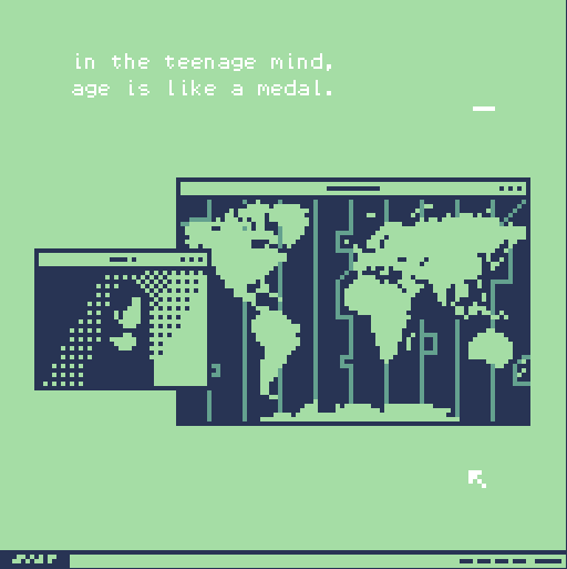
This becomes evident very early on, as the player is hit with ‘in the teenage mind, age is like a medal.’ Lines like these immediately brought a smile to my face due to the sheer authenticity of the idea being conveyed.
Age is exactly like a medal when you’re a teenager, it’s something I’ve subconsciously recognised, but never properly considered. The ability to control the pacing of the text entwines the player into the narrative in these moments, as they linger on a profound line for as long as they desire, reflecting on its significance.
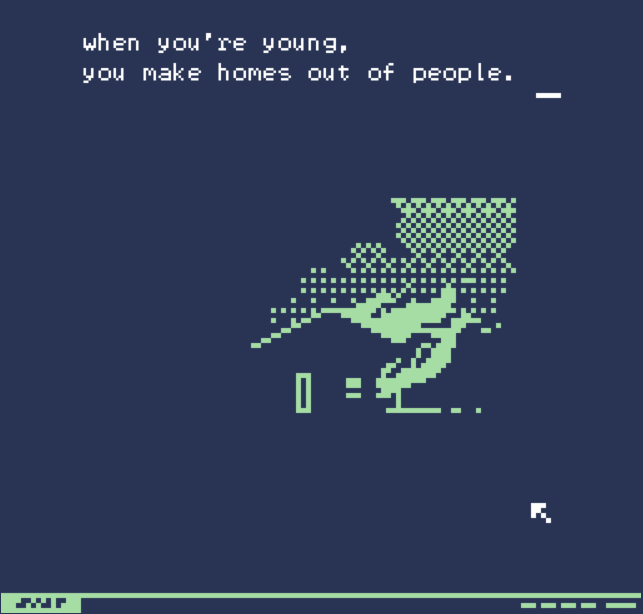
Richard combines this with the visual presentation shifting as the text is continued, creating many little captivating moments. The white text stands in slight opposition to the bright, pastel green background, but at certain points, it is exchanged for a darker, warmer blue. A revealing, evocative line paired with this visual effect creates a distinct rawness, a vulnerability that is difficult to describe but is unmistakably present.
Topography demonstrates the effectiveness of small design decisions such as these in creating a rich, palpable atmosphere, and a memorable experience.
Spiritwell
The demo for David Chen’s upcoming 2D RPG Spiritwell also boasts an expertly crafted atmosphere, and small, intelligently designed narrative moments. Its vibrant opening sequence drew me in immediately, with the lush scenery of a field lined with maple trees. I immediately found joy in the fluidity of the animations, and the simple but remarkable way the fallen leaves cleared as I waded through them.
This attention to detail did not falter past the opening either – not in its visual presentation, nor its design. After meeting my little frog companion called Kappy, a sequence began where he kindly offered to help me cross a river by forming a plank with his body. When crossing the water, I suddenly remembered to record my gameplay, and when I came back to Spiritwell, I was surprised to find Kappy complaining that I was still standing on his back.
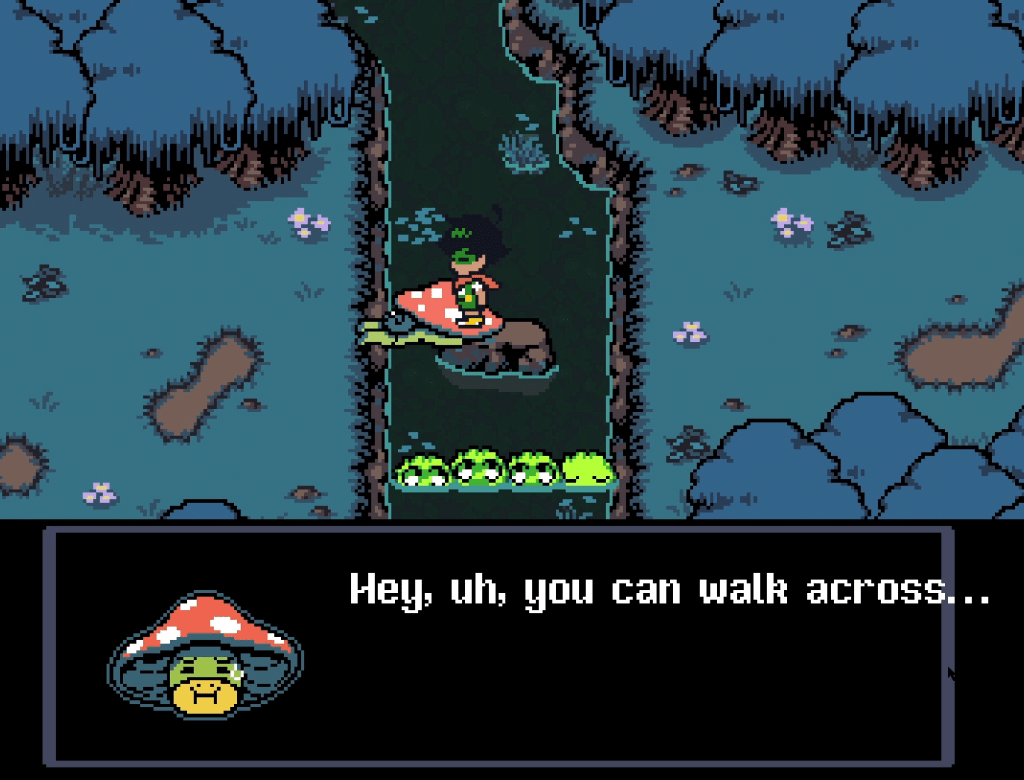
So began my attempts to betray the script at every situation I found myself in, which almost always resulted in the game reacting to my actions with a rewarding little piece of humour. These kinds of reactive narrative moments are not necessarily unique to Spiritwell, and are clearly inspired by games such as Earthbound and Undertale – Chen cites these titles, Pokémon, and Chrono Trigger as his main inspirations in this ACMI interview.
Yet arguably even these games do not match the frequency of these moments in Spiritwell’s demo, nor do they match how elaborate they can be. This is a key aspect of the game’s design, as not only does it complement the game’s light-hearted, playful tone, but it also seeks to replace something Chen has intentionally left out of the game – a battle system.
Unlike its inspirations, Spiritwell does not have any sort of battle system and instead focuses on its narrative and characters, making moments like these a key aspect of its gameplay. Just like Topography, there’s an elegance to how these memorable situations are created through very minimalist mechanics.
The previous situation with Kappy is simply created through the player having agency to walk, and stand still. In a later moment, the ability to “Use” or “Discard” items, gives the player a chance to eat some takoyaki in front of a street vendor, pleasing them so much they give the player more. Likewise, they can also discard the takoyaki, which hilariously sees your character toss it to the floor in front of the vendor, upsetting them greatly.
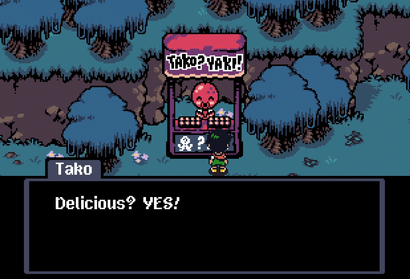
This simple design choice encourages players to remain observant, and explore every area of the game to its fullest. Spiritwell’s lack of combat means there is of course also no enemy encounters, a feature that is infamous for making it troublesome for players to explore the environment of many 2D Japanese RPGs to their fullest, as they have to grind through repetitive content in order to do so.
Here, the light-hearted playfulness present in the narrative and character interactions is also present in the player’s experience, as they are able to explore the world to their liking, discovering comedic moments as they interact creatively with the characters and environment. This cohesion made Spiritwell’s demo a joy to play, and hopefully will do the same for the eventual full release.
Trios
Trios, by Melbourne indie studio Samurai Punk, is a cohesive mix of relaxing math puzzles and lo-fi beats. Continuing Samurai Punk’s heritage of releasing titles that are either hilariously violent or pleasantly tranquil with seemingly no middle ground, Trios seeks to harness the simple pleasure of having numbers line up perfectly to solve a problem.
Naturally, we all have quite varied relationships with mathematics, so the question of how Trios handles difficulty was the first on my mind. The demo features simple addition and subtraction puzzles, that very gradually ramp up in difficulty. The full game resolves these concerns, with an adjustable slider that can make the game incredibly simple or equally challenging.

Just like Spiritwell and Topography, the genius of Trios comes from the minute design decisions that make the experience significantly more relaxing and rewarding. There’s a simple satisfaction in the game feel of connecting and popping the number bubbles, and rearranging them however you like to help mentally partition different layers of a problem.
Even when mulling problems over, you can idly throw the bubbles across the screen, sending them bouncing off the edges. Trios feels surprisingly like a maths “sandbox” game, in that it provides you with a relaxing, joyful workspace. The creation of this workspace is the result of these simple mechanics being fine-tuned towards the goal of consolidating the peaceful, pleasant atmosphere that Samurai Punk has developed.
Ultimately, this is the goal of developing a strong game feel for Trios, despite the design concept of “game feel” generally being present in discussions on fluid platforming, or juicy combat. With the addition of a collection system that fills planets with little discs for each problem you solve, and a diverse range of fitting lo-fi tracks, Trios is able to deliver a thorough exploration of its premise: a vast world of clear, comprehensible mathematical problems, to solve in a tranquil, delightful environment.
Perhaps it’s of no coincidence that during the endless difficulties of the pandemic, our local developers decided to create games that shine in their simplicity. Whatever the case, I think it’s important to remember, as we’ve seen from these three highlights of the Big Games Night In, that not every piece of clever design has to involve complex systems and mechanics.
Sometimes the pure elegance of a game’s design can be its most compelling feature.
This piece was commissioned as part of the 2021 Wordplay games writing mentorship program, a partnership between GamesHub and Melbourne International Games Week. Special thanks to mentors Dan Golding, Rae Johnson, Brendan Keogh, Alice Clarke, Jini Maxwell, and Edmond Tran.
